wilkinsburg_pittsburgh_merger_analysis
Wilkinsburg and Pittsburgh Annexation/Merger Analysis
[!IMPORTANT] This tool is no longer maintained as of the end of 2023, because the annexation effort ended in April 2024. Its tax rates were last updated for 2023 and are outdated by the 2024 tax year.
[!NOTE] The PA Supreme Court ended the annexation effort in April 2024 by denying the appeal of the pro-annexation side, upholding the lower court decision that the 1903 annexation law was repealed in the new 1968 PA constitution. Under PA law as of 2025, there is no way for a municipality of the second class1 (i.e., Pittsburgh) to merge with or annex a municipality of a lower class. Speculation in court offered that the referendum vote of both municipalities possible for smaller municipalities may apply if the PA legislature were to pass it, but such is unlikely to garner public support in the near future.
In November 2024, Wilkinsburg voted to adopt a Home Rule charter. The new governance features an empowered, voiced mayor, term limits for councilmembers, budget requirements, modernized compensation for elected officials, and, most important of all, rulemaking and legislation as independent of the PA legislature as can be under PA law. The transition team began its work in February 2025. The charter is not free of potential problems, but it is a massive step toward the maturity and independence befitting Wilkinsburg.
Epigraph
I must thank Chris Peplin for finding a problem with the calculator early on. I must thank councilmember Linda Atkins for asking me to do something to help explain the tax impacts of annexation. I must thank the folks behind Wilkinsburg Future for including me and this project early on.
In the end, many people thanked me for creating this calculator and graph. Several people commented to me throughout the process that this tooling changed their opinion on annexation, as it showed the real financial impact of it; just one (significant) aspect of such a major change that could help some Wilkinsburgers at the expense of others.
It is vital that technologists, including software developers, actively engage in local politics. Technology is inherently political. We can use our skills to bring change that enhances liberty. Judge Damon Keith wrote, “Democracies die behind closed doors,” which the Washington Post paraphrased to “Democracy dies in darkness,” its tagline announced in 2017. Through small acts of coding, we have the power to shed light on the truth.
Quick links
This little site contains some documents, graphs, and programs to analyze the proposed Wilkinsburg/Pittsburgh Annexation/Merger.
Share this site with a more speakable URL: j.mp/cd-wilk-pgh-merger or scan this convenient QRcode with your smartphone’s Camera app or QRCode reader app to geta link to this page.

What do I do with this information?
I believe that it’s important to make informed decisions supported by careful analysis of data. It’s on you to decide if the change in taxation is worth it for yourself, but consider also your neighbors.
Tax Calculator
The Tax Calculator shows what your household’s income and property taxes would be in two scenarios:
- a full annexation of Wilkinsburg and merger of the school districts
- a merger of the school districts but no annexation of the borough
(A third scenario, a municipal only combination without school district, is not possible and was removed upon this realization.)
Tax Graphs
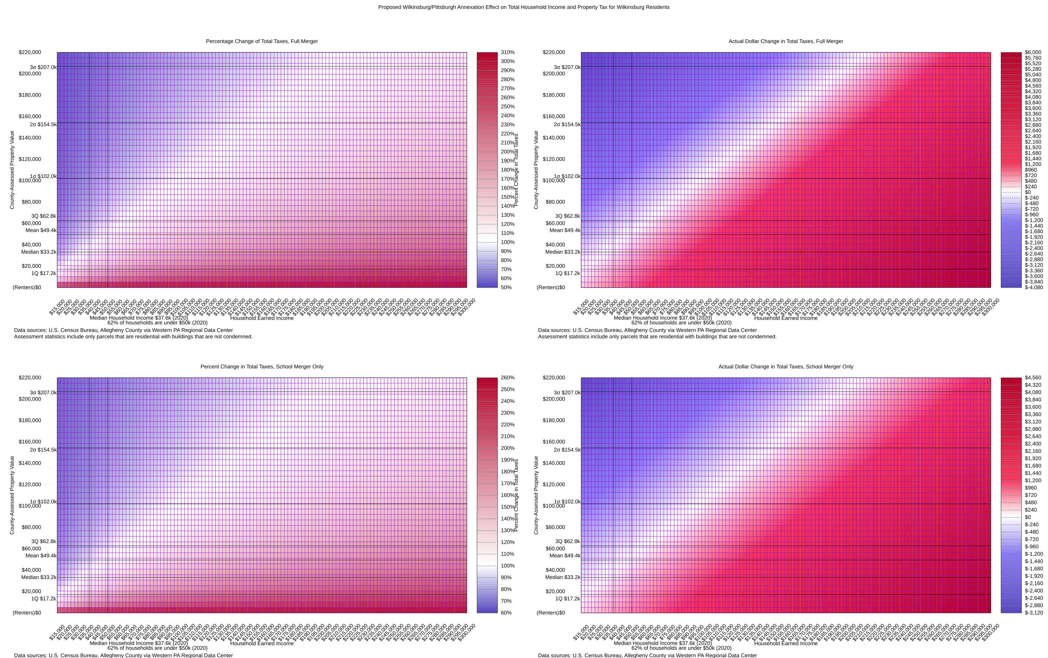
The heat map charts the percentage change difference when accounting for earned income taxes and real estate and school district property tax going from Wilkinsburg to Pittsburgh under the proposed annexation. The white line is “no change” while blue means lower taxes and red means higher taxes. The scale on the right of each graph shows the gravity of the change indicated by the darkness of the color.
:lightbulb: The top right graph, Actual Dollar Change in Total Taxes, Full Merger, is probably the most relevant to viewers.
Three version of the graph are provided:
- a scalable version that should look good on all screens and when printed (SVG)
- a compressed version that’s easy to share on social media (PNG)
- a more compressed version that’s smaller for email and mobile phones (WEBP)
Walkthrough
The coloration of the graph is kind of like heat: blue means taxes go down, red means taxes go up. The darker the color, the deeper the change. The white line that is approximately diagonal is where there is ultimately no change in taxation.
The graphs are quite simple math but I’ve chosen the ranges based on some heuristics:
- The range for property value is based on March 2022 county assessment data from WPRDC for the whole municipality, but residences only.
- The mean assessed value is around $48,000 in the standard deviation is about $52,500. I chose zero as the starting point for the benefit of renters and a little more than three standard deviations above the mean, approximately $220,000, as the max for that axis.
- For earned income taxes, I chose $15,000 as approximately full-time minimum wage and $300,000 as a two-income, highly-skilled professional household. I don’t know where I can get better data on incomes so if you have a suggestion I’m all ears.
- Noted on the graphs are the median income and 62% mark according to the US Census Bureau.
It’s important to note that renters aren’t well represented on the graphs because their property taxes are zero: they do not pay property tax directly. The owner of the property does. Working renters — 65% of Wilkinsburg residents rent — can expect to see a net tax increase in the event of an annexation or school district only merger unless property owners lower rent voluntarily commensurate with their lower property tax burden or through an act of borough or city government. So, if this series of graphs had a height relative to the percentage of residents at the crosspoint, some 65% of the volume would be at the very bottom of the graph, lessened only by the percentage of renters who do not have earned income.
The City of Pittsburgh parks tax of 0.5 mills is included in real estate tax calculations as of 7 November 2021.
A quick refresher on statistics
The graphs bear some abbreviations of statistical terminology to help explain where in the dataset some real numbers are.
| Symbol | Term | Meaning |
|---|---|---|
| 1Q | First quartile | 25% or 1/4 are below this level, 75% or 3/4 are above it |
| Med | Median | Approximately 50% are below and above this level, also called second quartile |
| 3Q | Third quartile | 75% or 3/4 are below this level, 25% or 1/4 are above it |
| x̄ | Mean | The mathematical average, the sum of the amounts divided by the count of amounts |
| σ / stddev | Standard deviation | A measure of variation from the mean; the smaller the stddev, the closer in general the amounts are to the mean |
| 1σ/2σ/3σ | First/second/third standard deviation | The number of standard deviations away from the mean, see also 68-95-99.7 rule. |
A note on “annexation” versus “merger”
When first conceived in mid-2021, this site used “merger” because of the supporters’ supposition that it was proposing an amicable merger. Not long after, I learned that the two municipalities do not qualify for the municipal merger laws but only for the municipal annexation laws. These are two different processes. The proper term for the action sought by supporters of the combination of the municipalities is annexation, and the use of merger anywhere in this process is disingenuous misinformation. The continued use of merger in this site’s name and in the names of files is purely to ensure that widely-shared links continue to work. It is no endorsement of the supporter’s continued misuse of the term. Rather, it is an artifact of the imprecision of misinformation and a reminder that we all have a responsibility to investigate claims with proposed solutions that would affect our democratic power.
Future Work
What I would love to do is somehow scale this or carve out areas on the graph that include various percentages of the Wilkinsburg population. The graphs do indicate the median household income with a vertical line but I don’t have any other data about household incomes in order to find where on the map the majority of Wilkinsburg residents are. According to Census Bureau data, approximately 62% of Wilkinsburg households are under $50,000 per year. I have a line representing that figure on the graph.
We do know from the USCB ACS that approximately 65% of Wilkinsburg residents are renters, but we don’t know how many are working and thus have earned income. If we knew that breakdown, it would be easier to add a third dimension to the graphs reflecting the percentage of the population likely to be at a section of the graph at each coordinate.
Help Wanted
I could use a GNUplot expert to help me clean up the code and help make the color changes more stark.
I could use someone interested in make a better small static website for this. I’m using GitHub Pages for now and it’s adequate but it could be snazzier.
Find a problem? Want to say thanks? Raise an issue.
All code for this mini-site, documents, and graphs are available here.
Quality Assurance
All sources of information should be cited. If you find a fact or figure that isn’t cited and it is represented as factual, please raise an issue on the repository.
The figures provided by these materials should be treated as estimates. Some information may grow out of date over time.
I try to act on bug reports quickly. However, as a volunteer, most of my time spent on this is on the weekends and late evenings, so there could be a few days delay before I’m able to address your concerns.
Who Built This?
This information is collected and presented principally by Colin Dean, a long-time resident of Wilkinsburg. There may be other contributors listed on GitHub.
How May I Use This?
 Any graphs, their source code, and associated data analysis code are licensed under a Creative Commons Attribution-NonCommercial-ShareAlike 4.0 International License.
 Any other source code is licensed under the Affero General Public License 3.0, except where noted.
-
Class is determined by population count primarily, although PA law specifically designates Philadelphia as first class and Pittsburgh as second class. ↩